Optimizing the site for search engines: Learn about the concept of responsive design
 By Admin

The topic of website design compatibility with smartphones is one of the topics that has received great attention recently, especially after Google focused on the necessity of website design compatibility to improve rankings in search results. In addition, many search engines have launched tools to check website design compatibility with smart phones. Among these engines we mention Google, Bing, and Yandex, but have you ever heard of the concept of responsive design?
Follow today's article with me to learn about this concept of website design and its compatibility with smartphones. Perhaps you will later exploit this technology to prepare your site for search engines and improve the ranking your site receives when searched for using smartphones. Topic Contents Toggle What is responsive design?
When was it used for the first time?
What is the motivation to use responsive design? How does responsive design work?
Final note: What is responsive design?
Responsive Web Design - or Responsive Web Design in English, or RWD for short - is a design concept that refers to websites with a design capable of compatibility with a large number of devices (computers and smartphones) through which the site can be browsed. In other words, responsive design is a design that changes dynamically to be compatible with the device through which it is being browsed. It is a design that rearranges itself according to the surrounding environment, like a lizard (in classical it is called the lizard J), that animal that It changes color depending on the surrounding environment. When was it used for the first time? The first time responsive design was used was in 2001 on the Audi.com website by a design team called razorfish. The design at that time was able to change according to the type of browser used and turn off some elements in the design if browsing was done through the Internet Explorer browser. After that, this technology witnessed many additions and modifications until the term RWD appeared for the first time in 2010 through an article published on the Internet explaining the most important conditions that must be met in the design of RWD.
What is the motivation to use responsive design? The main motivation for using responsive design is the great diversity of types of devices and the great difference in the screen sizes of these devices. This diversity requires a new method of design, as building a version of the site that suits each type of device and redirecting the user to the version of the page that matches his device is no longer effective. In addition to that, there is the great spread of mobile devices and their use for browsing at a high frequency, as the number of people who browse the Internet from mobile devices exceeds more than 50% of the total people who browse the Internet.
How does responsive design work?
Before we know how responsive design works, we must know the meaning of the term “response speed.” What is meant by responsiveness is the ability of the design to change in a rapid way that enables the user to browse the site in an easy way and without the need to enlarge or reduce the screen, and also reduce the need to use scroll bars to a minimum, but how does responsive design achieve these things? Responsive design is based on several concepts: The first concept is the concept of agile design, or in English Fluid. The basic idea of the agile design concept is centered around using percentages instead of using fixed measurements in pixels, as all dimensions are percentages compared to the screen size of the device used. Adopting percentages in measuring dimensions instead of using fixed dimensions in pixels has enabled the design to be compatible in size with any screen size, as its dimensions change depending on the screen size of the device used, which adds wonderful dynamism to the design. The second concept is the concept of dynamic dimensions of images. Remember that the first concept changes the dimensions of the page to suit the screen, and therefore we will need to change the dimensions of the images as well to suit the new measurements of the page. To achieve this, the measurements of the images were also set in a relative manner instead of a fixed measurement, thus ensuring that the images will change their dimensions in proportion to the size of the page and therefore with the size of the screen.
The third concept is called multimedia support queries, which are phrases about queries sent by the page to inquire about the capabilities of the device used for browsing, for example, the direction of writing, screen resolution, does the device work in vertical mode or in horizontal mode, and other queries that the page uses to adapt to the capabilities of the device and make the user feel that the page was designed specifically to be compatible with his device. A final note when you decide to work with responsive design, you must know that there are three other types of design: design with fixed dimensions, design with relative dimensions, fluid, and design capable of compatibility, so be careful not to confuse them with responsive design (RWD). #SEO
DROPIDEA
We hope this article has added real value to you. At DROPIDEA, we always strive to deliver high-quality content that helps you grow and evolve in the digital space. Follow us for more useful articles and guides.
Admin
DROPIDEA
Latest Articles

“Nofollow” tag: What it is, how and where it is used, “Infographics”

ASUS ROG Flow Z13 (2025) available: Everything you could dream of in a gaming tablet.

The best 5 sites to download safe computer programs without malware!
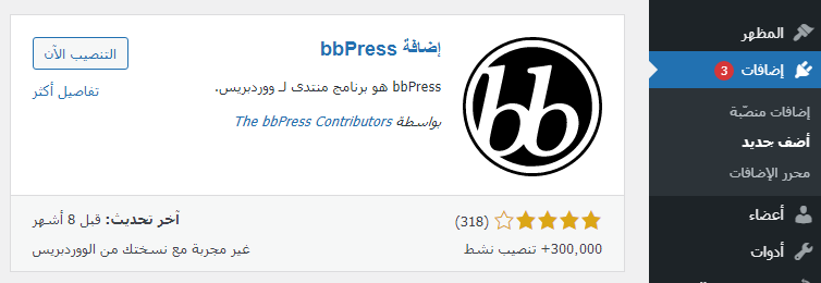
Create a forum on WordPress using the bbPress plugin step by step